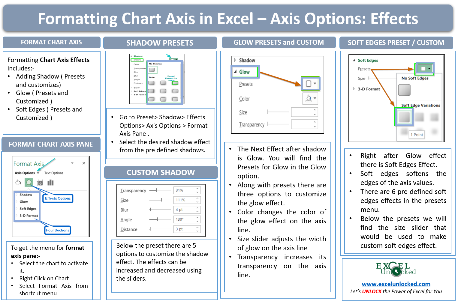
In this blog, we will be formatting the chart axis effects by taking an example of a Line Chart in Excel. In a line chart, the data series is represented by a line that may or may not be contiguous. There can be two horizontal and two vertical axes on the chart i.e primary and secondary. We will consider only the primary horizontal and primary vertical axis for this example.
Here we go 😎
What is Meant by Formatting Chart Axis in Excel
Formatting the excel cells includes font size, font color, fill color while formatting a chart axis is slightly different. Although there are a lot of formatting options for a chart axis, in this blog we will edit the effects used for the chart axis.
Moving Step Wise
There are the steps we made for you to follow.
Inserting a Line Chart in Excel
If we want to format a chart axis, we must make a chart first. Let us take an example where we have the website visitors of a business for 2020 and 2021 month wise. Below is the data.
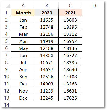
We have inserted a line chart for the above data by first selecting it and then Line Chart> Recommended Charts > Charts group > Insert Tab.
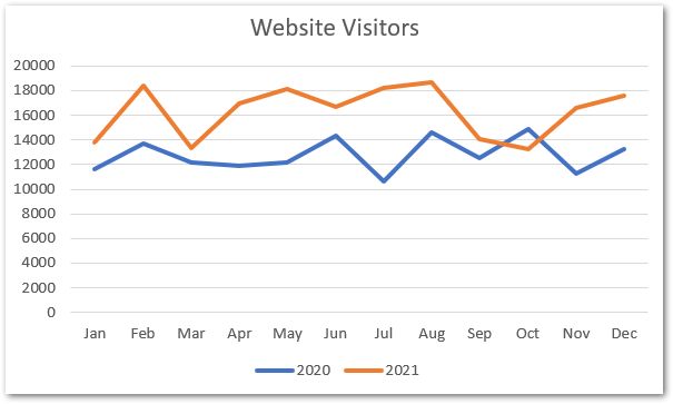
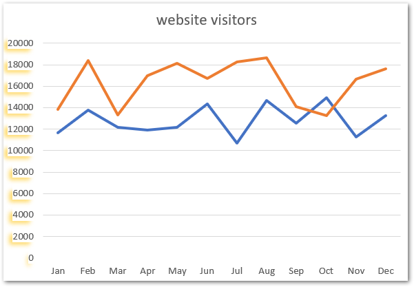
As a result, we have got a line chart where blue and orange line represents the website visitors for 2020 and 2021 respectively,
Analyzing Format Axis Pane
Now right click on the vertical axis and click on the format axis from the shortcut menu.
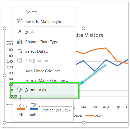
This will open up a Format Axis Pane at the right of the window.
Format Axis pane has two Sub panes named Axis options and Text options.
Formatting Chart Axis in Excel – Axis Options : Sub Panes
There are further four more panes in the axis options named: Fill and Line, Effects, Size and properties, Axis Options. We have worked with the Fill and Line in our previous blog.
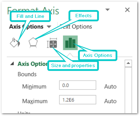
Chart Axis – Axis Options : Effects
The Effects has the following menu.
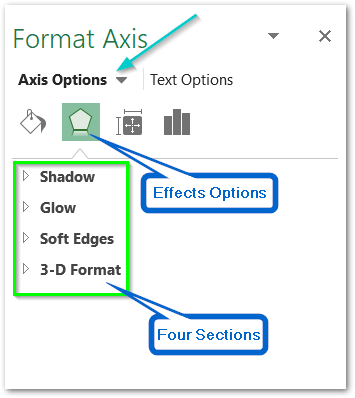
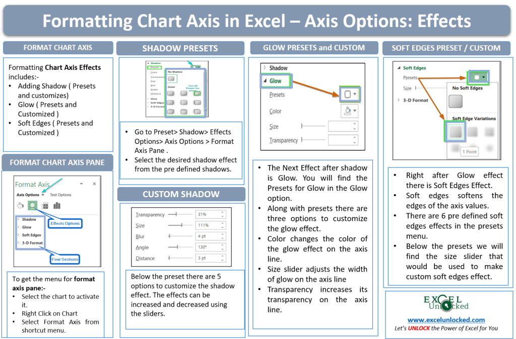
However, In this blog, we will be working with Shadow, Glow, Soft Edges, 3-D format > Effects Options > Axis Options > Format Axis Pane.
Effects: Shadow
We can add the Shadows to each of the axis values. The first option is for preset. Preset it to use the predefined shadow types..
Also Read: Format Chart Axis in Excel – Axis Options
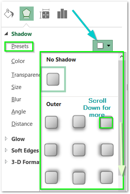
We have chosen the shadow preset as the bottom left.
After there is the color for the shadow. A shadow need not be black always as in real life. Here is the list of colors for the axis values shadow.
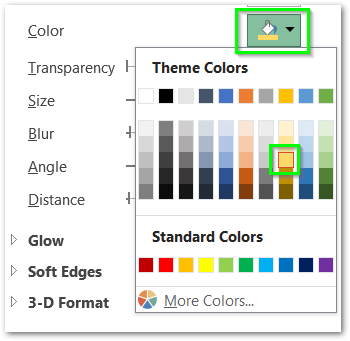
This is how the axis values will look after this.

The next four options are to customize and make your own shadow type.
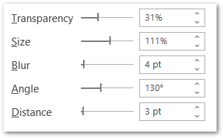
- Transparency – This is to make the shadow transparent. Increasing Transparency to 100 % would make the shadow completely invisible.
- Size – Size of the shadow increases or decreases the shadow size.
- Blur – More blur is the value of shadow, less sharpened it will be. In other words, 0 pt blur would mean a sharpened orange shape as shadow would be there.
- Distance – This is the distance between the axis values and the shadows.
- Angle – This is the angle between the axis value and its shadow. You can notice the angle change only when there is some distance between the angle and the shadow.
For now, we are setting the following values for them by their sliders.
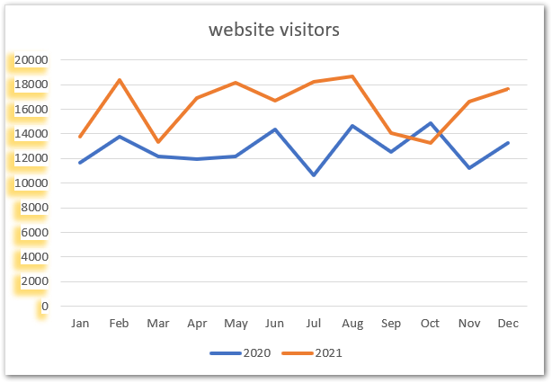
This is how the shadow for the chart axis will look now.
Effects: Glow
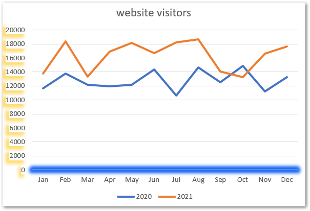
As the name suggests, glow makes the axis line glow from all four edges. We will apply this effect on the horizontal axis this time. Right-click on the horizontal axis and the format axis pane for the horizontal axis opens.
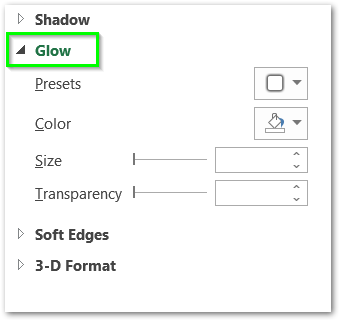
There are four options as you can see above. Presets have predefined glows for the axis values.
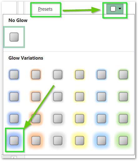
We can customize this preset as we want from the following menu.
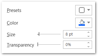
We have set the glow size and transparency to 8pt and 0% respectively.
This is how the horizontal chart axis line looks now.
Effects: Soft Edges
The soft edges option softens the axis line of the chart in excel. There are some predefined soft edges formatting sets as follows.
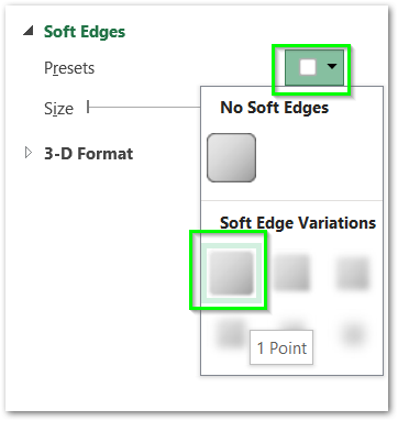
There is also a slider to adjust the soft edges to get it customized. We have formatted the vertical axis to 2pt soft edges with this slider. This is how it would look now.
This brings us to the end of the blog.
Thank you for reading 😉
RELATED POSTS
- Line Chart in Excel – Inserting, Formatting, #REF! resolving
- Make Your Own Chart Template in Excel
- All About Chart Elements of a Chart in Microsoft Excel
- Column Chart in Excel – Types, Insert, Format, Clickable Chart
- 3D Surface Chart in Excel – Insert, Working, Formatting Legends
- Change the Order of Data Series – Stacked Line, Stacked Area, Column Chart

