The Venn diagram is one of the most powerful advanced excel charts. There is no inbuilt chart type for creating a Venn diagram but we can make it by using the Bubble Chart. So To make a Venn Diagram, one must know the working of a Bubble Chart in Excel.
So let’s just start learning.
What is a Venn Diagram?
A Venn diagram is a visual representation of sets that are used to show the relations and intersections between them with the use of overlapping bubbles (circles) of the Bubble Chart.
With the use of Venn Diagrams, we can study which element lies in multiple sets.
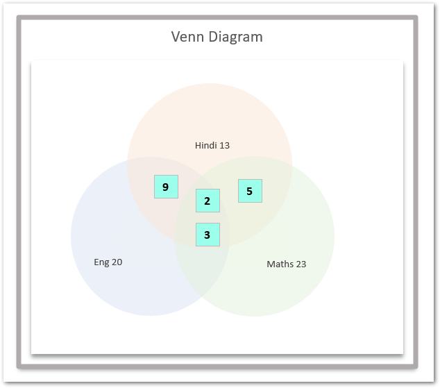
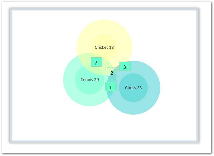
Moreover, this is how a Venn Diagram looks in real.
Components of Venn Diagram
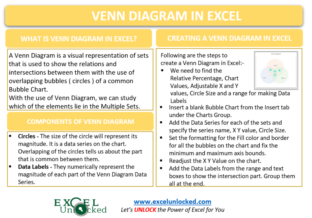
The following list explains the components of a normal Venn diagram:-
- Circles – The size of the circle will represent its magnitude. It is a data series on the chart. Overlapping of the circles tells us about the part that is common between them.
- Data Labels – They numerically represent the magnitude of each part of the Venn Diagram Data Series.
Creating a Venn Diagram in Excel
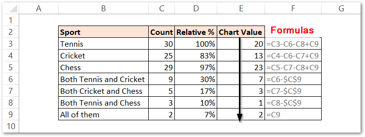
Let us say we have the count of students of a class who have voted for their favorite game out of Tennis, Cricket, and Chess. Some of the students have two games as their favorites while there were a few who choose all three games as their favorite. Here we have got the student count.
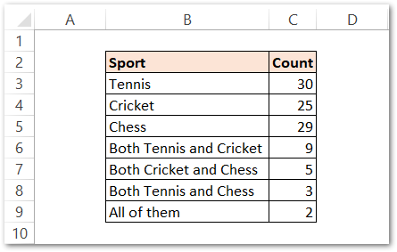
We need to transform this source data to make it Venn diagram ready.
Transforming the Source Data
Following are the steps to get the required source data:-
- Finding Relative Percentage
Make a Column for Relative Percentage and use the following formula in cell D3.
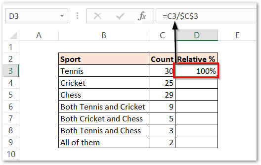
Copy this formula down the range by selecting D3:D9 and pressing the Ctrl D key.
- Finding Chart Values
Since there are the students who opted for more than one game, there we have a duplicate count in our entries. For instance, The Tennis has a count of 30 which also contains the students that opted for both Tennis and Cricket, Both Tennis and Chess as they also choose Tennis.
So we need to calculate the actual chart values to get the correct values of our data labels on the chart.
Now make a column for chart values. Use the following formulas in cells E3, E4, and E5.
=C3-C6-C8+C9
=C4-C6-C7+C9
=C5-C7-C8+C9
Now use this formula in cell E6.
=C6-$C$9
Copy this formula down the range E6:E8.
Enter =C9 in cell E9.
This is how the chart values will look
- Taking X and Y values
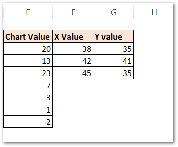
Copy-paste the following values of X and Y coordinates. They will help us position the circles on the chart. You can change them once the chart is plotted to change the position of circles of the Venn Diagram or to set the overlapping magnitude of circles.
- Taking the Circle Size
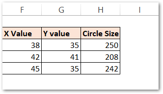
We need to take the size of the Circle which must correspond to the magnitude the circle is representing. There will be three circles on the chart as there are three games.
So make a column for Circle Size and then use this formula in cell H3.
=D3*250
Copy this formula down the range H3:H6.
- Making a range of Data Labels
We can add customized data labels to each of the series so simply take the following values of data labels or you can just copy the following formula in the range I3:I6.
=B3&" "&E3
This is our final prepared source data.

Inserting the Bubble Chart
We need to take an empty bubble chart. For this:-
- Make sure that the active cell is blank ( not on the source data ).
- Go to the Insert tab on the ribbon and click on the Scatter Chart button. Choose the Bubble Chart.
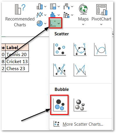
As a result, the empty bubble chart is inserted into the worksheet.
Adding Data Series ( Circles ) on the Chart
Each circle will be formed by a different data series on the chart. We need to take three data series on the bubble chart ( three bubbles ). Each Data Series require four things.
- Series Name ( Tennis, Cricket, Chess )
- X Values (F3:F5)
- Y Values (G3:G5)
- Bubble Size (H3:H5)
We can create one data series at a time. Right Click on the Empty bubble chart and choose the option for Select Data. Click on the Add Option in the series section.
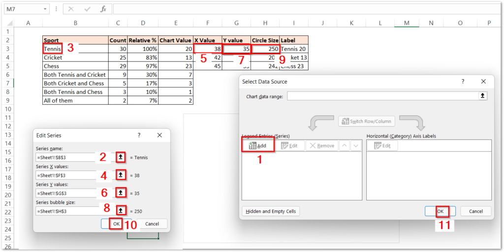
Perform the following clicks in the correct order.
Similarly, add the two more data series for Cricket and Chess by using the corresponding values in Columns B, F, G, and H to get the bubble chart as:-
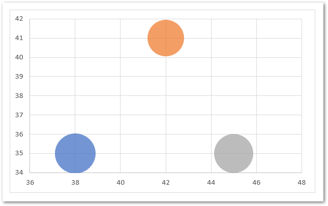
Formatting the Chart
We need to increase the size of the circles so that they could overlap. To increase the size of the bubble, simply:-
- Select the blue bubble on the chart.
- Press Ctrl 1 key to open the Format Data Point pane ( for Tennis )
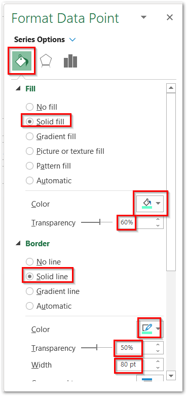
Choose the solid fill color and border color to be the same as the mentioned transparencies as 60% and 50%. Set the border width as 80 pt.
Similarly, you can do the same with the other two circles ( cricket and chess ) just choose a different color scheme. This gives us the chart as follows.
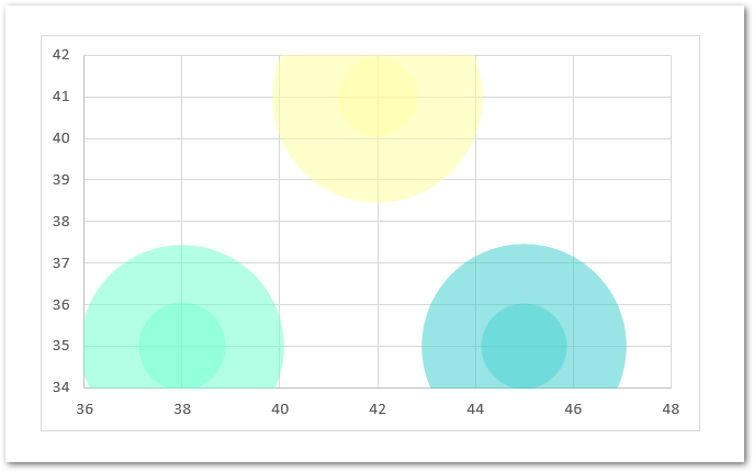
Since you can see that the bubbles are neither overlapping each other nor they are fitting properly into the chart. We need to first fix the minimum and maximum axis bounds.
For Horizontal Axis:-
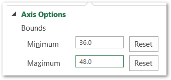
For Vertical Axis:-
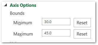
As a result, this will make the bubbles on the chart go like this:-
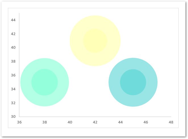
Now we can change their X and Y value so that they could overlap.
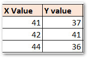
This updates the position of bubbles on the chart:-

However, you can remove the X-axis, Y-Axis, and gridlines by simply selecting them and then pressing the delete key.
You can add data labels to the chart from the range I3:I6. Add text boxes ( use cell references like =E6 to make it dynamic ) to show the intersection part on the chart and at last, you can group all the objects:-
- Select the chart and press the Ctrl-A key.
- Go to Shape Format Tab on the ribbon.
- In the Arrange group, click on the Group button to combine the text boxes with the chart.
As a result, we get our chart.
This brings us to the end of the blog. Thank you for reading.
RELATED POSTS
- Pictograph Chart in Excel – Usage, Making, Formatting
- Bubble Chart in Excel – Insertion, Working, Bubble Format
- Doughnut Chart in Excel – Single, Double, Format
- Interactive Pictograph Chart in Excel – Usage, Making
- Stacked Column Chart in Excel – Usage, Examples, Format, Special Gridlines
- Introduction to Charts in Microsoft Excel

