
This is the second tutorial of the Free ExcelUnlocked Pivot Table Course in Excel. In our previous section, we have understood the basics and overview of the Pivot Table feature in Excel. In this tutorial, we would take some real-life examples of how to create and use the Pivot Table feature in Excel.
Data Analysis and Visualization in Pivot Table
Firstly, you need to analyze the current dataset or data structure. And then visualize on how should the summary table look like. What is the field that you want to have a row and column headers? What is the end result that you target or expect out of it?
Only once analysis and visualization part is clear, you can easily create pivot table.
Before you proceed further, download the sample file by clicking on the Download button below, and practice as you read.
How to Create and Use Pivot Table Feature?
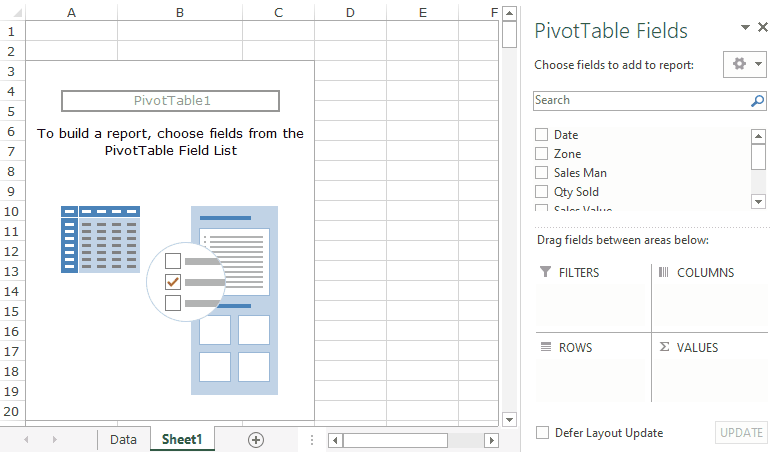
As we learned in our overview blog, the pivot tables are created by simple drag and drop mechanism, that’s it. There is no requirement to have expert knowledge on excel formulas and functions.
Also Read: Quick Overview On Pivot Table in Excel
Let us learn to create pivot table by taking scenario-based examples.
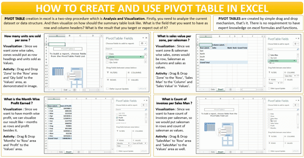
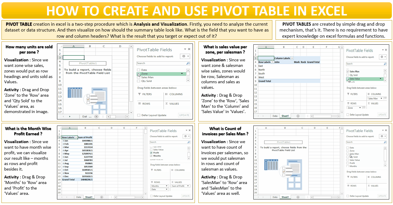
How many units were sold in each of the regions?
Suppose your manager asks you about a summary showing region-wise quantity sales. It would be just a matter of a minute task if you can visualize the desired end result layout.
As your manager wants region or zone-wise units sold, your visualization would go like this. Four regions would be placed as row headers and besides that, the units sold (in the adjacent column).
Now, when you have a visualization of the layout of the summary report, you are good to work on creating the pivot table now.
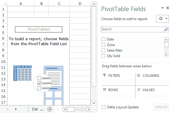
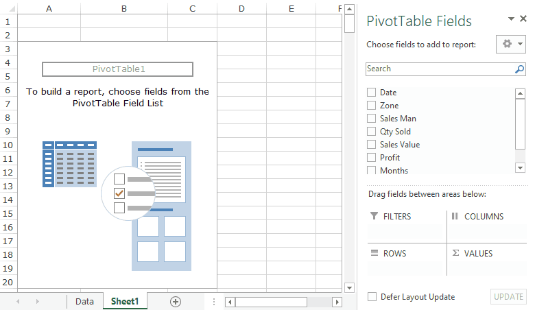
- In the Fields segment of ‘PivotTable Fields’ window, left-mouse click on the field ‘Zone’ and drag it to the ‘Row’ area and release the mouse. This would instantly put all the four regions in the worksheet.
- Similarly, left-mouse click on the field ‘Qty Sold’ and drag it to the ‘Values’ area and release the mouse.
What is the Total Sales Value per Zone and per Salesmen?
In this case, again the visualization would go like this – The row headings would be Zone, Salesmen names to be put as Column Headings and Sales Value in the Values area.
Even you can go with Zone as Column headings and Salesmen as Row Headings. It is totally on how you want your final report or result to look like.
- In the Fields segment of ‘PivotTable Fields’ window, left-mouse click on the field ‘Zone’ and drag it to the ‘Row’ area and release the mouse.
- Similarly, left-mouse click on the field ‘Sales Man’ and drag it to the ‘Columns’ area and release the mouse.
Finally, drag and drop the ‘Sales Value’ field in the ‘Values’ area, as demonstrated below.
There is another way to show it. You can show both ‘Zone’ as well as the ‘Sales Man’ in the row itself (instead of using column). The report in that case would look like this:

How much is the Month Wise Profit?
The expected end result (i.e. visualization) for month-wise profit would be like – ‘Date’ would become row headings. And ‘Profit’ would be placed in the Values box area.
- In the Fields segment of ‘PivotTable Fields’ window, left-mouse click on the field ‘Date’ and drag it to the ‘Row’ area and release the mouse.
- Similarly, drag and drop the ‘Profit’ field in the ‘Values’ area, as demonstrated below.
Here, you would notice that even though the field contains the dates, the excel grouped them into months. Also, if you check the ‘Row’ Area in the ‘PivotTable Fields’ window, you would find ‘Month’ as well as ‘Date’ over there. This is what is called ‘Grouping of Selection’ in the Pivot table.
We would cover the grouping of selection part later in this course.
What is the count of invoices made by each Sales Man?
In this case, the row headers would be the ‘Sales man’ and the Values will also be ‘Sales Man’. But why so, let us check on it.
- In the Fields segment of ‘PivotTable Fields’ window, left-mouse click on the field ‘Sales Man’ and drag it to the ‘Row’ area and release the mouse.
Similarly, drag and drop the ‘Sales Man’ field in the ‘Values’ area, as demonstrated below.
In the above demonstration, you can see that the excel automatically counted the rows per salesman instead of the total (like it did in previous examples). The reason is – Excel is smart enough to understand that the values in the salesman field are text and not a number/amount.
With this, you have completed this second tutorial on the Pivot Table Course in Excel. Now, I can confidently say that you can now create any type of Pivot Table and summarize your data as you need.
Just remember the golden rule learned in this blog – Data Analysis and Visualization. If you are able to visualize the end result, then 90% of your task is done, then simply drag and drop.
Check out other Excel Pivot table related blogs on Free Pivot Table Course by Excelunlocked.