A stacked Column Chart in Excel is a great idea to visually represent the grouped data. In the earlier blog, we learned the usage of the column chart in Excel. Column Charts become very fussy when we have multiple groups for the same input category. This is exactly when the Stacked Column charts come into their usage.
Here we go 😎
What are Stacked Column Charts in Excel
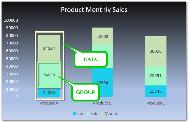
You must have heard of the word stack like a stack of books, a stack of papers. The word stack means one object piled on top of another. In a stacked column chart, the different groups for the same data category are piled over each other.
For example, if there are the sales of Products (A, B, C) for 3 months of a company then Product A would have three groups i.e Jan, Feb and March. Similarly, products B and C will also have three groups Jan, Feb, and March. If we make its chart, then the Sales of Product A will have the sales in Jan, Feb, and March sales stacked one on another.
Inserting a Stacked Column Chart in Excel
Let us say we have the quarterly sales of pastry, donuts, and cakes for a bakery. Below is the data:-
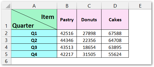
To insert a stacked column chart from this data:-
- Select the range of data (A1:D5).
- Go to Insert Tab.
- Move to charts group and click on column chart button.
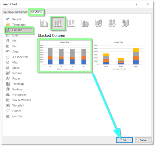
- The Insert Chart Dialog Box opens. Go to All Charts.
- Select the stacked column chart.
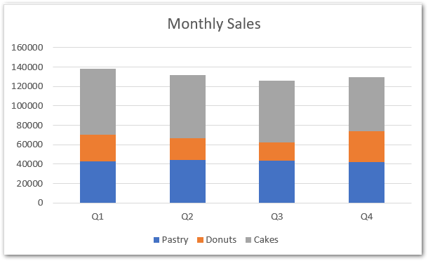
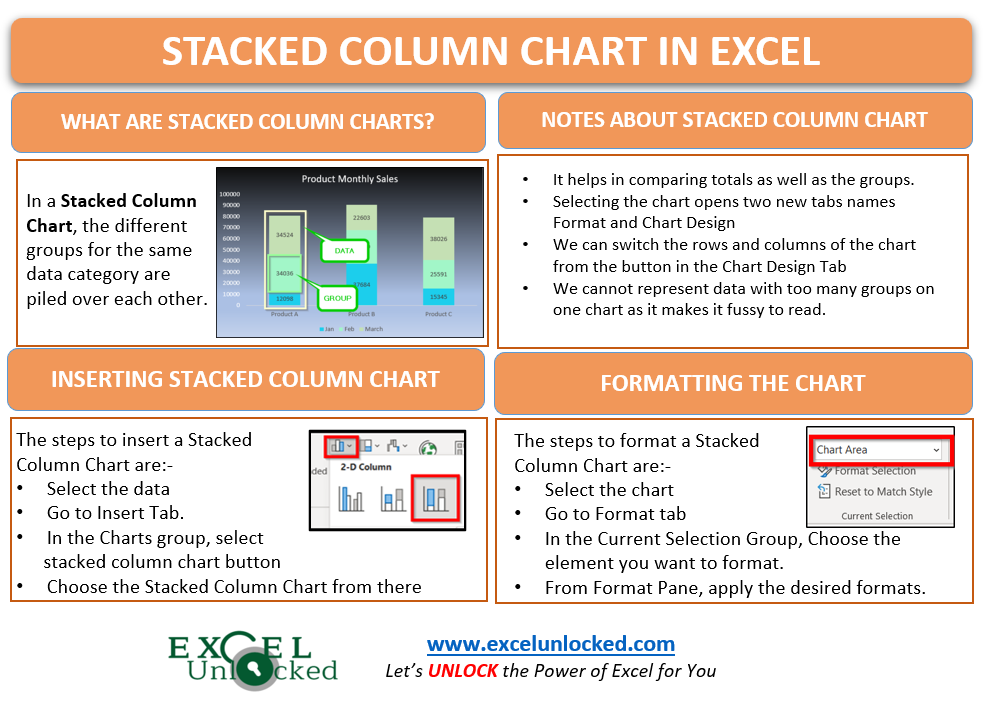
The following chart will be inserted:-
Formatting a Stacked Column Chart in Excel
The default chart inserted with predefined formatting might not look like what we want. Formatting the chart makes it relevant to the color scheme used in the entire excel spreadsheet that contains the chart.
Formatting Chart Area
We will now format the chart by changing the Chart Area.
- Select the chart.
- Go to Format tab.
- In the current selection group, choose chart area from the list.
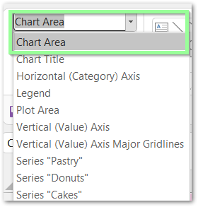
- Click on Format Selection Button in the Current Selection Group.
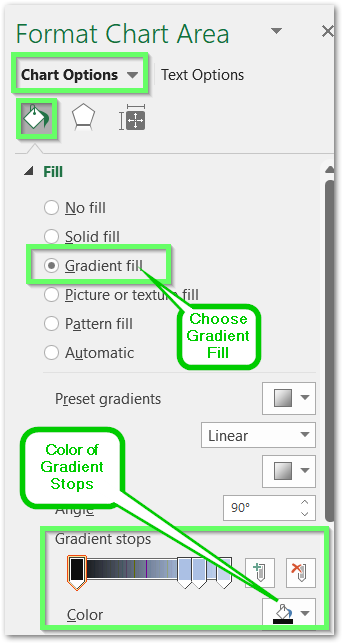
- The Format Chart Area Dialog Box Opens.
- Go to Chart Options < Fill and Line Tab.
- Choose Gradient Fill. Select the colors of Gradient Spots.
Formatting Data Series
There are three data series in our chart named “Cakes”, “Donuts”, “Pastry”. You can see them in the chart.
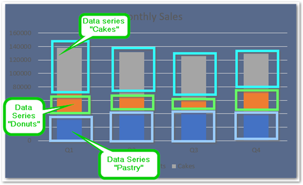
We can format each of the data series by repeating the following steps for each of them:-
- Select the Chart and go to format tab.
- In the current selection group, click on Data Series “Cakes”.
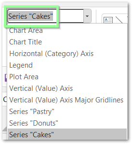
- Click on Format Current Selection Button. Click on Solid fill and choose the desired color.
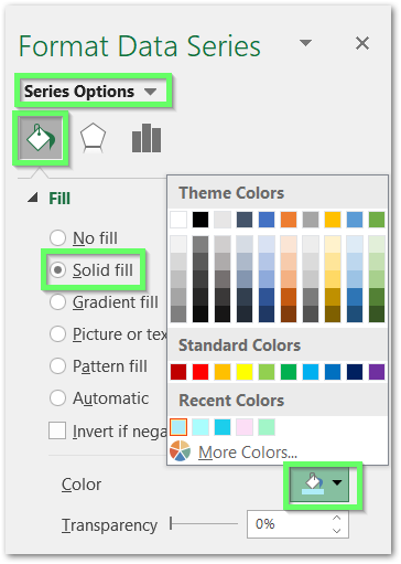
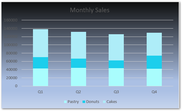
Similarly, you can format the other two data series by changing the current selection. This is how the chart looks after this.
Formatting Chart Title and Vertical Axis
The chart title is not visible enough because we have chosen a dark color as the background color. However, We can change the text color of the chart title to white color.
- Select the chart and go to format tab.
- Choose Chart title in the current selection.
- In the Format Chart Title pane, choose text options.
- In the text fill, click on solid fill and choose the desired color.
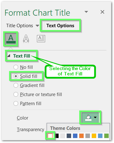
Repeat the same procedure for the Vertical Axis of the chart.
The chart would look something like this.
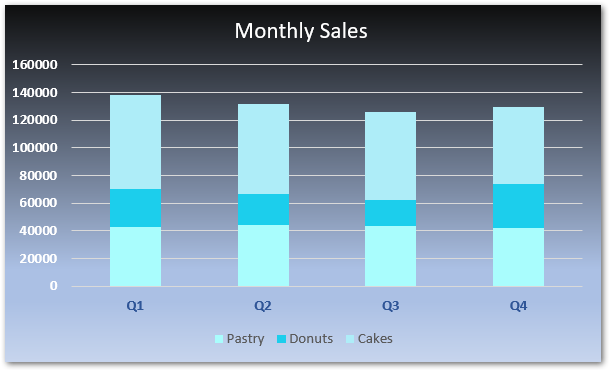
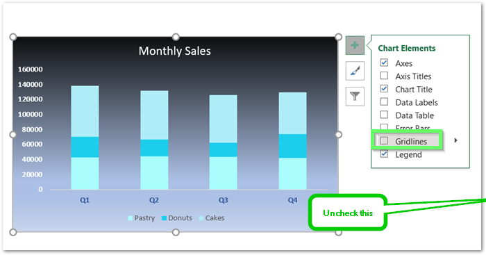
Adding Special Gridlines to Stacked Column Chart in Excel
Firstly, To add special gridlines we need to remove the existing grid lines.
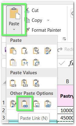
Now select the range B1:D5. Click on cell E1. Go to the home tab and click on the paste link button.

Now if you change any value in the cells B1:D5, it would automatically reflect in the range E1:G5. For instance, we are changing some of the sales values to check if the link has been created successfully. You can make your changes or note the following.
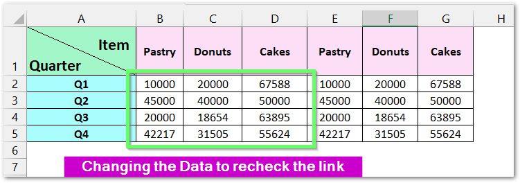
Doing this will add three more data series to the existing quarters Q1, Q2, Q3, and Q4. For this change to reflect in the chart, we need to update the source data.
Right Click on the Stacked Column Chart and select “Select Data” from the shortcut menu.
In the Select Data Source Dialog box, click on Change Chart Range Button and select the range A2:G5
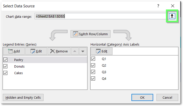
This is how the chart looks now.
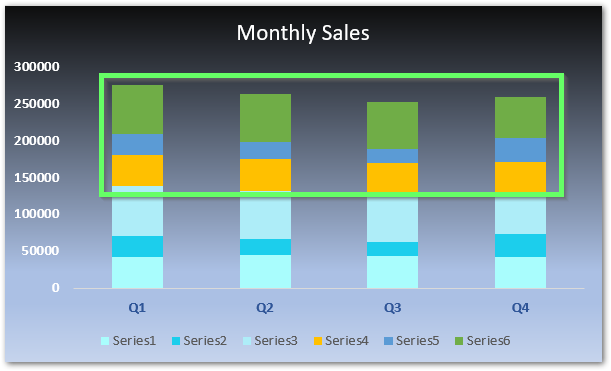
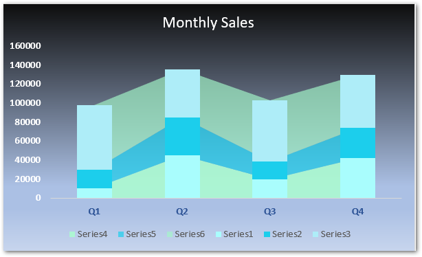
Three new data series were added in each quarter. Consequently, we can select each new data series and format them to a specific color.
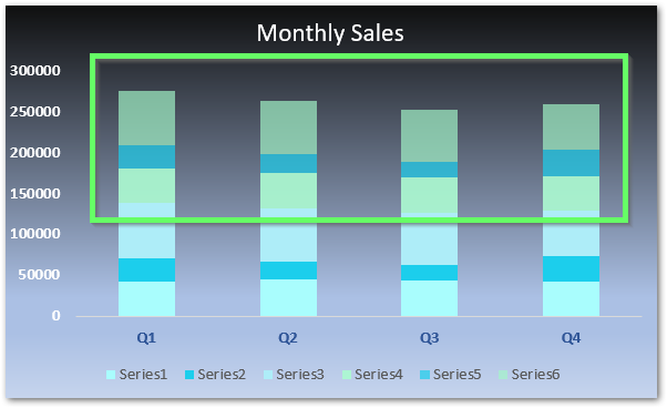
We have matched the color of series 3,4 and 5 with series 1,2, and 3. but with some transparency levels.
Now select the chart, go to Chart Design Tab and click on the change data type button.
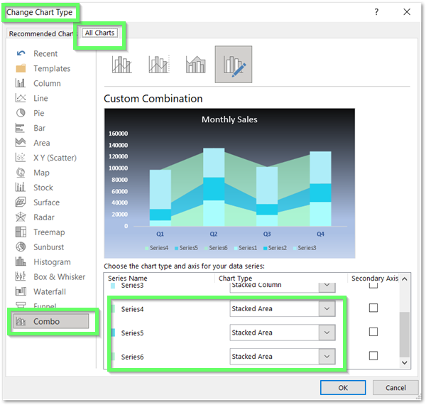
Go to Combo Chart and Select Stacked Area for Series 4, series 5, and series 6.
The Stacked Column Chart with these special gridlines has been inserted.
Points To Know About Stacked Column Chart
The following Points about Stacked Column Chart must be kept in mind.
- It helps in comparing the total as well as the groups.
- Selecting the chart opens two new tabs named Format and Chart Design.
- We can switch the Data with Groups ( quarters with items ) by Swicth Rows and Column Button in the Chart Design Tab.
- We cannot represent Data with two many groups using the Stacked Column Chart as it makes it difficult to read.
This brings us to the end of the blog.
Thank you for reading 😉
RELATED POSTS
- 100% Stacked Column Chart in Excel – Inserting, Usage, Reading
- Bar Chart in Excel – Types, Insertion, Formatting
- Stacked Area Chart Excel – Usage, Insertion, Area vs Line, Negative Values
- Sunburst Chart in Excel – Usage, Insertion, Formatting
- Doughnut Chart in Excel – Single, Double, Format
- Make Your Own Chart Template in Excel
